Lights off: dark mode is here, Partner API docs included
The developer site now has a dark theme. It follows your system setting, remembers your choice and covers every page, and AI helped us build it in a matter of hours.
We’re really excited about this one. The Snap Finance developer site now has a dark mode, and it reaches every corner of it: the Partner API reference and its “Try it out” panel, the SDK guides, webhooks, the blog, and even the retailer page generator.
If you spend your evenings with the Partner API reference open next to your editor, it should now feel right at home next to your dark IDE and terminal. And if you prefer the light theme, nothing changes for you: light mode looks exactly as it did before.
How to use it
- It follows your system setting. If your device is set to dark mode, the site opens in dark mode, with nothing to configure.
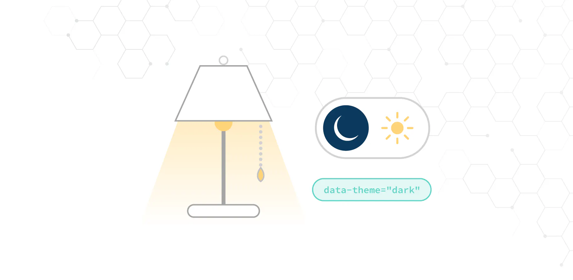
- Or pick it yourself. Use the sun and moon switch in the header, next to Merchant Portal Sandbox. Your choice is remembered on that browser and takes priority over the system setting.
- No flash of the wrong theme. The theme is applied before the page is drawn, so a dark page never flashes white while it loads.
Built with AI, in a matter of hours
Dark mode is one of those features that sounds small and isn’t. Every stylesheet on the site had colours written into it, and each one had to be checked in both themes without breaking the light theme that thousands of visits rely on. In the past, that would have taken us weeks.
This time we paired with an AI coding assistant, and the whole feature went from idea to working pages in a matter of hours. We made the decisions: what dark should look like, which pages it should cover and what had to stay untouched. The assistant did the heavy lifting:
- It went through around 55 stylesheets and sorted every colour into what should follow the theme and what is a fixed brand colour, such as the white text on our navy buttons.
- It took screenshots of every page in both themes, at desktop and phone sizes, and fixed what it found, like icons that disappeared on the dark background.
- It compared screenshots of the light theme from before and after the change, pixel by pixel, to prove that light mode hadn’t moved.
- It wrote the tests, including the ones for the small script that picks the theme.
Reviewing a careful, well-explained change is a lot faster than writing it from scratch, and it let us spend our time on the parts that need a human eye. We’re thrilled with the result, and with how quickly we can now ship improvements like this one.
How it’s built
1. Colours that know the theme
Every colour that changes between themes is a CSS custom property: page background, cards, borders, text, headings, links and a few more. The light and dark values live in one place, and the dark set applies whenever the page’s root element has data-theme="dark". Components only ever use the variables, so switching theme is a single attribute change, with no re-render and no extra stylesheet to load.
2. Respecting your browser setting, without a flash
A small script runs in the page’s <head>, before anything is drawn. If you’ve picked a theme with the switch, it uses that. Otherwise it asks the browser for your system setting through the prefers-color-scheme media query, and keeps listening, so if your device switches to dark at sunset, the site follows along. Because the theme is set before the first paint, there is no flash of the wrong colours.
3. A switch that stays in sync
The switch in the header flips the attribute and saves your choice. It also watches the attribute, so its icon stays right even when the theme changes because of your system setting rather than a click. It’s a real button with a label that says what it will do, so it works with a keyboard and with screen readers.
4. The details that make it feel finished
- Code blocks match. In dark mode, the light code samples across the docs take on the same navy window style as the Partner API terminals, so every snippet looks consistent.
- Selected states flip. Things that are navy with white text in light mode, such as the active blog filter and our navy buttons, turn white with navy text in dark mode, so they don’t vanish into the background.
- Previews stay true to life. The retailer page and email signature previews stay light, because that’s how they’ll look on your website and in your customers’ inboxes.
- Forms are readable. Input borders and dropdown arrows have their own theme colours, so forms stay clear on both backgrounds.
Tell us what you think
Dark mode is live now, so give the switch a try. If you spot anything that doesn’t look right in either theme, let your Snap Finance account manager know and we’ll fix it. And now that we know how fast we can move, expect more improvements like this one soon.